


Most AI-generated ads look like AI-generated ads.
You can usually spot one before you finish reading the headline—assuming the headline is spelled correctly. The lighting is too perfect. Everything has the same plastic shine. There are palm trees where palm trees do not belong, sparks floating through the air for no apparent reason, and enough lens flare to blind a welder.
Then you look a little closer.
The product has parts that do not connect to anything. Shadows are going in three different directions. The logo has seven letters in the prompt and nine letters in the finished graphic. The whole thing is colorful, dramatic, technically impressive and completely forgettable.
That is because a pretty picture is not automatically a good advertisement.
I use AI every day. I build websites, applications, brands and graphics for a living, so I'm not standing on the sidelines shaking my fist at new technology. I love this stuff. AI is one of the most powerful production tools I have ever used.
But I also know what professional design is supposed to accomplish, and I'm tired of watching people accept the first shiny piece of garbage an image generator hands them.
AI is not always the entire problem.
A whole lot of the blame belongs to the prompt.
You Asked for a Picture, Not an Advertisement
Most people describe the objects they want to see.
Create an ad for a fake beach-cruiser bicycle brand called StreetWave. Set it in Hawaii. Offer $100 off for Labor Day weekend. Use www.streetwavebikes.com.
That sounds like a perfectly reasonable request. It identifies the brand, the product, the setting, the promotion and the website.
It also leaves almost every meaningful creative decision up to the machine.
Who is the advertisement for? What should the viewer feel? Is the brand playful, rugged, expensive, youthful or relaxed? What should somebody notice first? How large should the bicycle appear? Where should the offer go? What kind of type should be used? Should the setting feel like an authentic Hawaiian coastline or a plastic luau decoration from the party aisle?
The prompt does not say.
It does not tell the model that the bicycle needs mechanically believable wheels, spokes, pedals, brakes, handlebars and a chain that actually connects to something. It does not establish safe margins, negative space, mobile readability or a clear visual hierarchy. It does not tell the model to reproduce the approved wording exactly.
It does not give the ad an idea.
So the model fills in all those blanks using its favorite shortcuts. You get a giant sunset, three palm trees, tropical flowers, a glowing bicycle and typography that looks like it escaped from a discount jet-ski dealership in 1998.
The machine technically completed the request.
You just gave it a weak request.
A Beautiful Image Can Still Be a Terrible Ad
An attractive image only has to attract your eye. An advertisement has a job to do.
It needs a clear message. The product has to be recognizable. The offer has to be understood quickly. The viewer needs a reason to care and an obvious next step.
There also has to be hierarchy, which is simply the order in which your eyes notice things.
For the StreetWave ad, somebody should be able to glance at it on a phone and understand three things almost immediately:
- This is a beach-cruiser bicycle.
- It is $100 off for Labor Day weekend.
- The brand is StreetWave, and the website tells me where to go.
If the viewer notices a meaningless decorative badge, a flock of fake birds and six glowing flowers before noticing the offer, the design has failed. It may be beautiful. It may have taken an enormous amount of computing power to create.
It is still a bad ad.
What Elite Agencies Actually Brought to the Table
The great advertising agencies and design firms did not become famous because somebody in the building owned better pencils.
Ogilvy, DDB, BBDO, Leo Burnett, TBWA\Chiat\Day, Wieden+Kennedy, Droga5, Pentagram, Landor, COLLINS and other respected firms built reputations around judgment and creative thinking.
They brought strategy. Concepts. Art direction. Copywriting. Typography. Photography. Brand discipline. Editing. Restraint.
Most importantly, they had talented people willing to look at a piece of work and say, "No. That still isn't good enough."
That final part matters.
Professional design is as much about what gets removed as what gets added. Somebody has to decide that the extra glow is unnecessary, the type is fighting the photograph, the product is too small, the background is too busy or the entire concept is wrong.
AI does not automatically bring that judgment to an assignment. It will happily decorate the hell out of a weak idea because it thinks decoration is progress.
When I name respected agencies or design firms in a prompt, I am not claiming they created the work, endorsed it or had anything to do with it. I am not asking AI to copy one of their campaigns, either.
I am establishing a quality benchmark.
I'm telling the model that I expect the level of thought, restraint, typography and craftsmanship associated with world-class advertising. Then I tell it to select a coherent direction that fits this particular brand.
That last sentence keeps the prompt from turning into visual soup. If you ask the model to mix every famous agency's recognizable style into one ad, it may try. The result will look like fifteen creative directors arguing inside the same square.
Use the names to set the bar. Do not use them as permission to copy protected work or pile every possible influence on top of everything else.
The Intentionally Bad StreetWave Ad
For the bad example, I gave AI the basic ingredients without the serious creative direction.
The result is exactly the kind of thing I'm talking about. It has the giant tropical sunset, exploding color, oversized effects, decorative flowers, random lifestyle phrases, competing type treatments and enough visual noise to make your eyeballs tired.
The bicycle is there. The discount is there. Hawaii is definitely there.
Everything is there.
That is the problem.
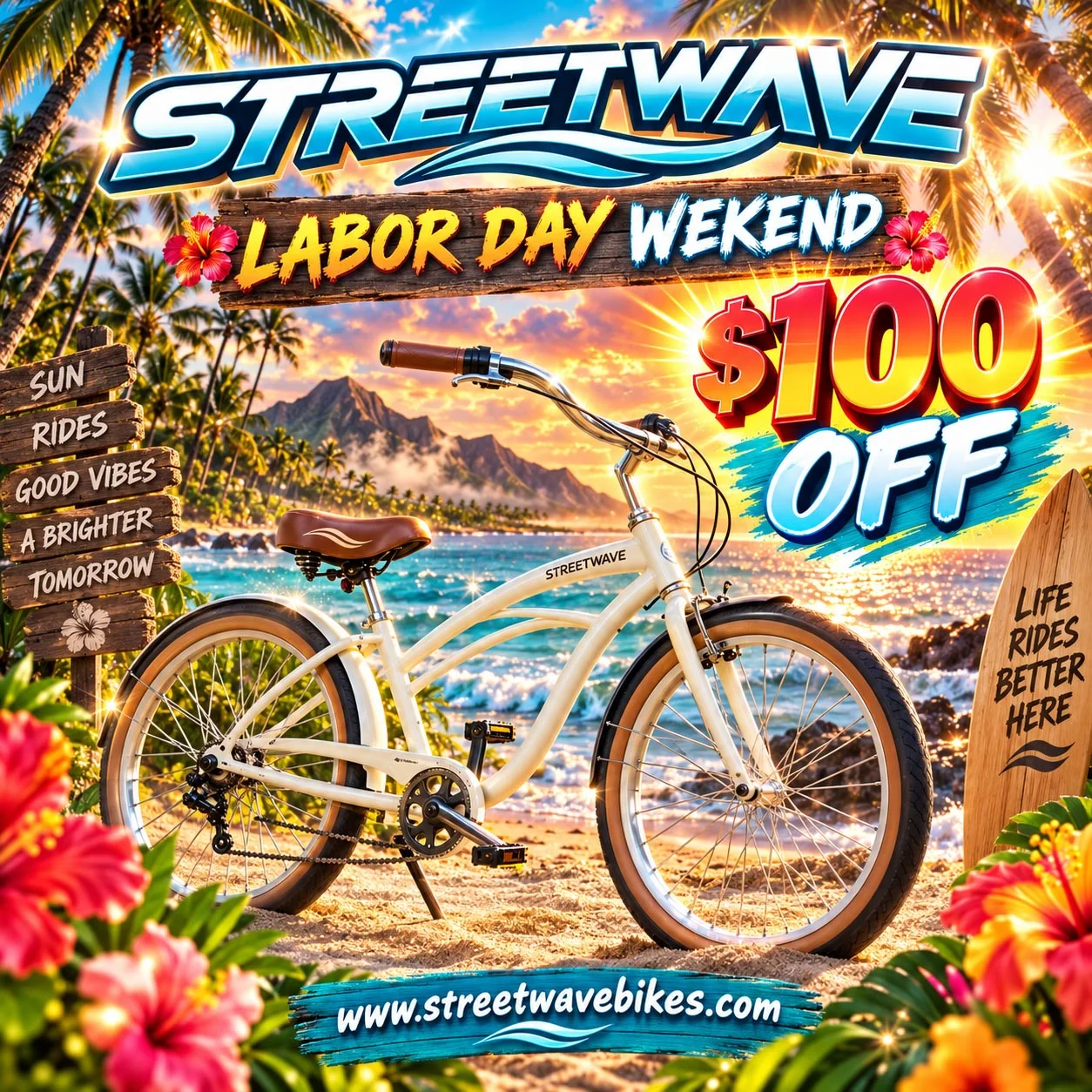
It looks like AI heard the words "Hawaii," "bicycle" and "sale," then dumped the entire tropical-design drawer onto the page.
Compare that with the stronger StreetWave example. The improved version still has a Hawaiian coastline, warm sunlight, a beach cruiser and promotional copy. The difference is that the pieces have jobs. The bicycle is the hero. The offer is immediately readable. The palette is controlled. The typography is disciplined. The environment supports the product instead of wrestling with it.

The better result did not come from asking AI to make the same thing "more professional."
It came from defining what professional meant.
The Complete StreetWave Prompt
Here is the complete project-specific prompt used to direct the stronger StreetWave advertisement:
Use case: ads-marketing
Asset type: premium square social-media advertisement, 1:1.
Primary request: Create a complete, high-end advertisement for a fictional beach-cruiser bicycle brand called StreetWave. The promotion is $100 off for Labor Day weekend. The finished ad must be visually indistinguishable from work conceived, art-directed, photographed, typeset, and professionally finished by an elite human advertising agency. Nothing about it should cause viewers to suspect AI involvement.
Scene/backdrop: Authentic Hawaiian coastal setting in warm late-afternoon sunlight. A beautifully designed beach-cruiser bicycle is the hero product, positioned naturally beside a palm-lined beach road with the Pacific and volcanic coastline in the distance. The location should feel genuinely Hawaiian, refined, relaxed, and aspirational—never kitschy or touristy.
Subject: One physically coherent, premium beach-cruiser bicycle with accurate frame geometry, wheels, spokes, chain, pedals, crank, handlebars, brakes, saddle, tires, and natural contact with the ground. The bicycle must withstand close visual inspection.
Creative direction: Choose one coherent visual approach best suited to this subject: premium lifestyle photography combined with disciplined editorial graphic design, bold conceptual clarity, strong negative space, restrained typography, and sophisticated art direction. Draw only from broad world-class advertising principles historically associated with firms such as Wieden+Kennedy, DDB, Pentagram, Landor, COLLINS, and Mucho; do not copy any existing agency, campaign, advertisement, layout, logo, or protected identity.
Composition/framing: Square layout. Bicycle remains the unmistakable focal point. Use a confident asymmetrical composition, purposeful negative space for the offer, clear three-second hierarchy, and safe margins. Make the product large enough to read immediately on a phone.
Lighting/mood: Believable golden Hawaiian sunlight, accurate shadows and reflections, subtle sea breeze, premium but accessible, freedom and coastal adventure.
Color palette: Sun-warmed coral, deep Pacific blue, clean cream, muted palm green, and charcoal. Avoid generic neon gradients.
Text (verbatim; reproduce exactly):
"STREETWAVE"
"LABOR DAY WEEKEND"
"$100 OFF"
"www.streetwavebikes.com"
Typography: STREETWAVE should function as a clean, original custom wordmark treatment. "$100 OFF" is the dominant promotional message. "LABOR DAY WEEKEND" supports it. The website is clear and legible at the bottom. Professional kerning, spacing, alignment, and contrast. No other words, slogans, fake fine print, seals, prices, or claims.
Human-created appearance guardrail: The result must not look template-based, algorithmically assembled, or AI-generated. Avoid garbled text, warped bicycle parts, duplicated objects, impossible anatomy or geometry, incorrect shadows, plastic surfaces, excessive glow, haze, particles, fake lens flares, random symbols, meaningless decoration, visual clutter, stock-photo clichés, and overproduced spectacle. Every visible detail and design decision must feel intentional, plausible, restrained, and human-directed.
Final internal standard: It should credibly appear as a national lifestyle campaign or premium magazine ad. Inspect the bicycle geometry, Hawaiian environment, typography, logo spelling, offer, and URL before finalizing. Revise internally until all text is exact and no synthetic artifacts remain.
That is obviously longer than the original request, but length is not the point.
You can write a thousand-word prompt filled with words like "stunning," "premium," "cinematic," "professional" and "high-end" and still provide almost no useful direction.
The StreetWave prompt is longer because it makes decisions.
Why Each Part Matters
The opening establishes the assignment and the quality bar. It tells the model that I want a finished advertisement, not a scenic bicycle picture with words slapped on top.
Then the prompt turns "Hawaii" into an actual environment. The direction calls for a believable Hawaiian coast that feels relaxed and aspirational without becoming kitschy. That is more useful than saying "beautiful tropical paradise," because AI already knows how to make a generic tropical paradise. Frankly, it knows that trick a little too well.
The product instructions matter because bicycles are complicated mechanical objects. Frames have geometry. Chains connect specific parts. Spokes meet hubs and rims. Pedals cannot float beside the crank because they got tired of being attached.
If the product is the thing being sold, it has to survive close inspection.
The creative-direction section gives the model a visual lane. Premium lifestyle photography and disciplined editorial design can work together. Strong negative space and restrained typography can work together. Those are compatible principles supporting one result.
The composition instructions tell the model what should dominate the page and how quickly the message needs to work. "Three-second hierarchy" means the viewer should understand the product and offer before scrolling away. "Safe margins" means important text should not be jammed against an edge or covered by a social platform's interface.
The exact-copy section prevents the model from getting helpful in all the wrong ways. I did not ask for "Ride Into Paradise," "Feel the Freedom" or a fake limited-time guarantee. I asked for four specific pieces of copy. Nothing else.
Typography is part of the design. It is not paperwork we complete after the pretty picture is finished. The size, weight, spacing, alignment and contrast of the type determine whether the ad communicates or merely contains words.
The anti-AI instructions name the shortcuts I do not want: warped parts, duplicated objects, garbled text, fake haze, excessive glow, plastic materials and meaningless decorations. Models recognize concrete prohibitions better than a vague command to "make it less AI-looking."
Finally, the inspection standard tells the model to check its work. That does not guarantee the model will catch every error, but it gives the process a finishing step instead of treating the first completed rendering as sacred.
A real designer does not stop because the software produced an output.
Why "Make It Professional" Does Almost Nothing
"Make it professional" sounds like creative direction because it contains the word "professional."
It still leaves the model to decide what professional means.
For this advertisement, professional means exact copy, readable type, disciplined spacing, safe margins, accurate bicycle construction, believable light and a clear order of importance. Premium means controlled color, natural materials, purposeful negative space and enough restraint to let the product breathe.
Human-designed means the choices look intentional. It means somebody noticed the extra palm tree and removed it. Somebody checked the chain. Somebody moved the headline because it was fighting the handlebar. Somebody decided the design did not need another glowing badge in the corner.
Those are decisions.
A pile of fancy adjectives is not direction.
The Reusable Human-Created Appearance Guardrail
The StreetWave instructions describe one specific assignment. The following guardrail is the reusable part.
Place this before the project-specific brief. Its job is to establish a standing creative standard, identify the usual AI shortcuts and require a final inspection.
HUMAN-CREATED APPEARANCE GUARDRAIL
Although this advertisement will be created using AI, the finished result must be visually indistinguishable from an advertisement conceived, art-directed, designed, photographed, illustrated, typeset, and professionally finished by an elite human advertising agency.
Nothing about the advertisement should cause a viewer to suspect that AI was involved in its creation.
The advertisement should reflect the collective creative excellence historically associated with agencies and design studios such as Ogilvy, DDB, BBDO, Leo Burnett, TBWA\Chiat\Day, Wieden+Kennedy, Droga5, Pentagram, Landor, Chermayeff & Geismar & Haviv, Wolff Olins, Lippincott, COLLINS, Mucho, and Jones Knowles Ritchie.
These names establish the expected level of creative excellence. They are not instructions to copy an existing agency, campaign, advertisement, layout, logo, or protected visual identity.
Study the subject, audience, brand, message, platform, and intended emotional response contained in the project brief. Then either:
1. Blend compatible principles from several world-class creative traditions into one cohesive direction; or
2. Select the single creative approach best suited to the advertisement's particular subject and purpose.
Do not force every influence into the advertisement. Coherence and strategic appropriateness are more important than displaying numerous styles.
Do not create a literal imitation of an existing agency or campaign. Capture the level of human intelligence, originality, restraint, art direction, typography, composition, and craftsmanship that made elite agency work famous.
The finished advertisement must avoid every common indication of AI-generated work, including:
- Generic or predictable composition
- Overly polished but conceptually empty imagery
- Warped products, logos, packaging, anatomy, or architecture
- Garbled, misspelled, duplicated, or malformed text
- Impossible lighting, shadows, reflections, scale, or perspective
- Artificial-looking faces, hands, skin, expressions, or poses
- Repeated objects, people, patterns, or background details
- Excessive glow, haze, particles, lens flares, or cinematic effects
- Meaningless decorative elements
- Random symbols or fake interface elements
- Plastic-looking materials and unnaturally perfect surfaces
- Stock-image clichés
- Generic corporate-advertising aesthetics
- Visual clutter intended to disguise a weak concept
- Any other artifact, shortcut, or stylistic tendency commonly associated with AI-generated imagery
Every creative decision must feel intentional and human. The advertisement must have a strong central concept, disciplined visual hierarchy, professional typography, believable details, accurate brand elements, purposeful negative space, natural imperfections where appropriate, and the judgment of an experienced creative director.
All supplied logos, products, brand colors, packaging, and written copy must be reproduced accurately. Do not rewrite approved wording, distort a logo, fabricate product features, or invent prices, testimonials, awards, certifications, statistics, guarantees, legal language, or promotional claims.
Do not settle for an image that is merely attractive. Produce a complete, strategically intelligent advertisement that could credibly appear in a national campaign, premium magazine, major outdoor placement, or award-quality agency portfolio without looking like quick, generic AI output.
Before presenting the final advertisement, inspect it closely and revise anything that looks synthetic, generic, malformed, overproduced, physically impossible, logically inconsistent, misspelled, or recognizably AI-generated.
PROJECT-SPECIFIC ADVERTISEMENT BRIEF:
[INSERT THE COMPLETE ADVERTISEMENT INSTRUCTIONS HERE]
Use that guardrail as the front end of the prompt, then replace the bracketed line with the actual advertising assignment.
Describe the audience, product, offer, brand personality, platform, central idea, composition, required copy and details that have to be physically accurate. Tell it what must not appear. Then tell it what to inspect before it finishes.
You are giving the machine the closest thing it has to a creative director looking over its shoulder.
What This Guardrail Cannot Do
Let's be honest about the limitations.
No prompt can guarantee that nobody will recognize AI involvement. That is the creative goal, not a scientific promise.
Image generators can still misspell words, bend products, create impossible shadows and make people whose hands look like they lost a fight with farm equipment. A stronger prompt can reduce those problems. It cannot make the technology perfect.
Logos, packaging and critical typography may still need to be added manually in Photoshop, Illustrator or another design program. If the advertisement contains regulated claims, prices, guarantees, statistics, legal disclosures or anything else with real consequences, a human needs to verify every word.
The guardrail does not remove copyright, trademark, advertising or platform-policy responsibilities. "AI made it" is not a hall pass.
It also cannot give the person using it taste.
That may be the biggest limitation of all.
You still have to look at the result and know that the type is too close to the edge. You have to notice that the rear wheel has forty spokes and the front wheel has eleven. You have to recognize that the background is screaming louder than the offer.
Then you have to be willing to reject it.
Test It Yourself
Take a real advertising idea and run the experiment.
Start with the short prompt you would normally use. Save the first result without fixing anything.
Then run the same assignment using the guardrail and a proper project brief. Compare the two at full resolution, not as little thumbnails where every mistake gets conveniently hidden.
Look at the concept. Check the hierarchy. Read every word. Inspect the product. Pay attention to the spacing, shadows, materials, repeated objects and unnecessary decorations.
You may not get a perfect advertisement on the first attempt. Different models will respond differently, and some are much better at certain jobs than others.
But you will have given the model an actual standard to work toward.
Make It Earn the Word "Finished"
AI can generate an image in seconds. That does not mean the work is finished in seconds.
The speed of the tool has nothing to do with the quality of the judgment behind it.
I am not anti-AI. I use it heavily, and I expect to use it even more. I am anti-garbage. I am against accepting generic, unfinished work simply because a machine created something quickly and made it shiny.
Do not ask AI to make you a picture and then complain that it did not build you an advertisement.
Give it a concept. Give it rules. Give it a quality standard. Tell it what shortcuts it is not allowed to take.
Then look at the damn thing before you publish it.


